Art Nouveau and Art Deco antiques and heritage restorers’ fair

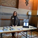
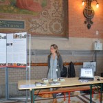
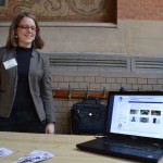
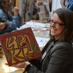
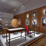
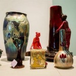
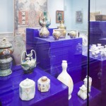
DSC_0031The Royal Institute for Cultural Heritage, Brussels (KIK-IRPA) took part in the Art Nouveau and Art Deco antiques and heritage restorers’ fair organized during the Biennale Art nouveau-Art Déco in October. 50 photographs of Art Nouveau objects that were digitized in the frame of the Partage Plus project were shown to the audience. Book marks promoting the project were handed out to heritage professionals, architects and fans of the Art Nouveau period.

The 2013 Biennial Event in Brussels puts special emphasis on the buildings of architect Henry van de Velde, to celebrate the 150th anniversary of his birth. One of the leading lights of Art Nouveau, alongside Victor Horta and Paul Hankar, Henry van de Velde had a huge influence on the Modernist movement and twentieth-century design.

Posted in Uncategorized | Comments Off

VIENNA 1900 AT MAK − AUSTRIAN MUSEUM OF APPLIED ARTS/ CONTEMPORARY ART

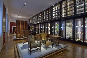
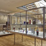
1900_raum_1The fascinatingly complex cultural epoch denoted by the term “Vienna 1900” has long been the stuff of legend. And the equally multifaceted and momentous output of this period’s artisans and designers is now the focus of a newly completed section of the MAK Permanent Collection.

Visitors are invited to engage in a multilayered examination of the “Vienna 1900” phenomenon that covers three rooms. This section of the Permanent Collection, which had gone unchanged since 1993, is the first to have been reconceived. The new presentation’s content was developed by Christian Witt-Dörring together with the museums’ collection curators, and the Viennese designer Michael Embacher was responsible for the individual rooms’ design.

VIENNA 1900. Design / Arts and Crafts 1890–1938 adheres to a largely chronological structure: the first room is dedicated to the search for a modern style; the second room features a close look at the Viennese style; and the third room points the way to the International Style. Around 500 collection objects are shown in various thematic combinations that serve to shed light on art-historical and sociopolitical aspects relevant to Viennese modernism.

For further information:

http://www.mak.at/en/program/event/vienna_1900_6?reserve-mode=active

Copyright: MAK/Georg Mayer

Posted in Uncategorized | Comments Off

3D scanning at the Museum of Applied Arts in Budapest

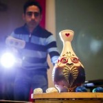
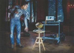
With the objective of digitizing a selection of 200 high-class Art Nouveau objects from the Museum of Applied Arts, the team of Steinbichler Optotechnik GmbH arrived in Budapest this week. Within 14 days art works from the Ceramics and Glass Collection of the museum, such as vases and other iridescent ceramic objects from the Hungarian Zsolnay Factory, as well as pieces of furniture, Art Nouveau jewellery and many more are going to be 3D scanned.

The results will be made available on the Partage Plus website soon!


Photos by Bálasz Mohai, Hirado.hu

Posted in Uncategorized | Comments Off

The Whitechapel Art Gallery

Written by Karoline Schwenker
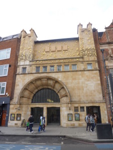
P1050189There are many different theories about how to improve the welfare of a community. Some believe building anew will provide a fresh start. Others emphasize business investments and capitalism.  And yet another idea is that a community will improve if education and appreciation of the arts is encouraged. It is through this line of thinking that some of the great galleries and museums have been built. For instance, Samuel Augustus Barnett and his wife Henrietta would organise art exhibitions at the St. Jude’s school house in Whitechapel (passmoreedwards.org.uk). The annual exhibitions were such a success that eventually a building was constructed to house the event, and it was named the Whitechapel Gallery. Of course, like most educational and cultural endeavours, it can be difficult to find funding.  In fact, it is only in the past couple of decades that gallery actually started receiving steady financial support. Yet, despite these struggles, the establishment has adhered to it mission of supporting local and new artists, as well as promoting appreciation for culture and education.

As mentioned, the first exhibition was actually organised prior to the construction of the Whitechapel Gallery. This exhibition was put on in 1881 by Barnett who was then vicar of St. Jude’s Hospital. Thousands of people attended, which lead to the exhibition becoming an annual event. It was because of the desire to continue promoting appreciation for art and history that Barnett and his wife wanted to build a permanent gallery. It so happened that around this time the building next to the Passmore Edwards Library in Whitechapel was up for sale. Barnett was able to purchase the site through a generous donation by Passmore Edwards, the very man who was the financial backer of the free library. Edwards had originally promised additional funds, but these required the gallery being named after him as the library had been. Barnett could not agree to this stipulation, for he wanted even the name of the building to reflect the fact that it was for Whitechapel residents. However, additional financial backers were found to provide the rest of the funds, and construction could be completed (passmoreedwards.org.uk). The task of building and constructing the gallery was given to Charles Harrison Townsend, a man known for his Arts and Crafts style of architecture. On this occasion many feel the gallery is representative of the Art Nouveau movement, but it is possible Townsend would have preferred to call it late Arts and Crafts (victoriaweb.org).
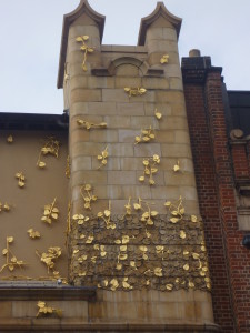
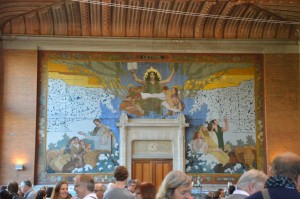
P1050186While enough funding was found to complete the building, there was not enough to match the entire amount of additional funds Edwards was going to give. As a result, the vision Townsend had for the gallery could not be completely fulfilled. The aspect that is most noticeably missed is the mosaic by Walter Crane that was meant to be positioned above the entry arch between the two towers. Despite the lack of mosaic, the building is undoubtedly attractive. Rather than using symmetry and placing the entrance at the centre of the building, Townsend chose to position the arch and double doors to the left. The asymmetry along with the keyed arch, foliage patterns, and twin towers all make the building bright and imaginative. All of this is purposefully constructed so as to emphasize the ideals set out for the Whitechapel Gallery. The original trustees wanted the gallery to introduce East Londoners to a world beyond that in which they work. The hope was to incite curiosity and encourage people to find pleasure in feeding their minds (victoriaweb.org). The building supports this by first its appearance in comparison to those structures near it. Unlike the brick and dark buildings around it, the gallery is bright and inviting. The doors open right onto the street, which provides easy access and acts as open arms inviting passersby to enter (victoriaweb.org).

Whether due to the appearance of the building or the draw of the artworks, the opening of the Whitechapel Gallery in 1901 was a success. Over the six weeks that the exhibition was open, 200,000 people visited the gallery. Exhibitions in the following years similarly were successful, such as the exhibition of Jewish Art and Antiquities in 1906 and the Shakespeare Memorial and Theatrical Exhibition in 1910. However, despite the popularity of the gallery, funding was continually an issue. The first exhibition in 1901 only raised £100. The gallery needed £500 a year to survive, and donations alone would not cover this. Many prominent individuals, families, and city guilds supported the gallery, but it was difficult to find steady support. Financial struggles increased with the arrival of World War I. It was not until 1948 that these issues began to recede a little. It was in that year that the Whitechapel Art Gallery Society was formed, and their aim was to find private and business funding to support the gallery. With this help and the provision of grants from the London County Council and Arts Council, the gallery was able to not only survive but take on new exhibition projects. During the 1950s and 1960s the gallery exhibited Modernist artists and attracted higher numbers of visitors. By 1982, the funding from non-government sources was so great that the Whitechapel Art Gallery Foundation for formed. Then, in 1987, the American Friends of the Whitechapel Art Gallery Foundation Inc was formed in order to raise funds in the USA. The gallery’s circumstances only improved from there. In fact, due to the generous support of their visitors, patrons, and grants, the gallery was able to be renovated in 2009 and expand into the former Passmore Edwards Library next door (passmoreedwards.org.uk).
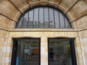
P1050196In addition to monetary concerns, many were worried that the gallery would lose sight of its original intent, which involved reaching the local community. It was always the aim of the gallery to exhibit local artists, so as to encourage the creativity and curiosity of the local people. This was certainly achieved during the 1920s when funds were low. In fact, the gallery became known as the “Working Man’s Gallery.” During this time, east and west Londoners had strong opinions of each other. The west viewed the east as low and poor. In a 1922 magazine article about the Whitechapel Gallery it is stated that this gallery is one that “the poor” might not be ashamed. It goes on to say that there is “something in the lowly air of Whitechapel that soothes the mutual enmity between the lion and the lamb.” The writer refers to the “West End Jekylls” being able to actually find enjoyment in the territory of the East London “Mr. Hyde” (RRT 1922). While there will always be those in need of education or improvement in their circumstances, it is harsh to term such people as the Hydes of society. There is no reason that those from the West End should be surprised to find culture in the East side of London at that time. Perhaps the knowledge that such opinions were held about them encouraged those in Whitechapel to support their gallery and take pride in their work in spite of what others thought.

As the years passed and World War II came to an end, condescending viewpoints of East London began to be quelled. In a 1951 magazine, the writer explains that times have changed and there is now “disgust at the very idea of ‘simple instruction for simple people’ or of ‘converting the working class to art’” (Burlington 1951). This disgust was naturally felt by the East End public, but also by sponsors of exhibitions and those in other parts of London. The writer praises the regional character of exhibitions at the Whitechapel Gallery and hopes that it will not adopt the ways of galleries in central London. The gallery was established for Whitechapel, and the writer felt it important that creativity and individuality were continually promoted (Burlington Magazine 1951).

While there have been many highs and lows for the Whitechapel Gallery when it comes to visitor numbers and funding, the gallery has continually worked to focus of local artists, education, creativity, and individuality. It is because the gallery was willing to exhibit lesser known artists, creative themes, and ambitious exhibitions that the Whitechapel Gallery can boast of being the first to exhibit many artists who are known internationally today. Of course, given the focus on local artists, many prominent British artists have shown their work, such as Mark Rothko, David Hockney, Gilbert & George, Richard Long, and Lucian Freud. Additionally, there were also exhibitions that featured artists who never exhibited in the UK or were little known in the UK. Some of these artists include Picasso and his showing of Guernica, Jackson Pollock, Frida Kahlo, Liam Gillick, and Nan Goldin (whitechapelgallery.org). Despite all these famous artists, it is not them who make the Whitechapel Gallery so remarkable. The gallery is remarkable for its struggle and journey to become what it is today, facing financial hardships and stereotypical remarks but still persevering for the sake of education and appreciation of art.


Further Reading:

Editor (1951). Editorial: the Whitechapel Art Gallery. The Burlington Magazine,93(574), 3-4.

R.R.T. (1922). The Whitechapel Art Gallery. The Burlington Magazine for Connoisseurs,40(229), 197.

http://www.victorianweb.org/art/architecture/townsend/1.html

http://www.e-architect.co.uk/london/whitechapel_gallery_building.htm

http://www.passmoreedwards.org.uk/pages/history/Libraries/Whitechapel%20art%20gallery/history%201.htm

http://www.whitechapelgallery.org/about-us/history/history-of-firsts
Posted in Uncategorized | Comments Off

The Pontefract Museum: Caring for a Community

Written by Karoline Schwenker

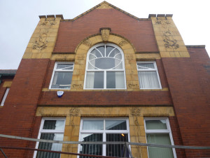
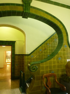
Pontefract Museum 01It is impressive how an art movement not only influences countries individually, but also creates connections between countries that one might not necessarily expect. This is true of the Art Nouveau movement that occurred between 1890 and 1910. There are the obvious connections, such as designs infused with Asian or Middle Eastern style. It is also known that many architects of the movement travelled throughout Europe, which influenced their designs and techniques. However, another aspect that would connect countries together was the construction of Art Nouveau style buildings; for, these required a source of funding, an architect, and a chosen location. Naturally, it was not always the case that all three were found in the same country. A perfect example of this is the construction of the Pontefract Museum in Pontefract, UK.

In 1895 a proposal was put forward to build a Free Library in Pontefract. However, when the local residents voted, only 150 out of 850 people voted in favour of its construction. This all changed when in 1902, Andrew Carnegie was approached by the Town Clerk regarding funding for this Free Library (wakefield.gov.uk). Carnegie was born in Dunfermline, Scotland, but moved to the United States when he was thirteen. While there he worked his way through the American industrial sector and emerged a steel tycoon. During his time, he was one of the wealthiest men in the world, as well as one of the greatest philanthropists in the world (philanthropyroundtable.org). Carnegie believed that those blessed with wealth had an obligation to give away their money for the benefit of the community. Naturally, each person must provide for his or her family, but any additional funds should be used to help “poorer brethren” (Carnegie 2006). As Carnegie reasoned, the rich made their wealth through the working of those in poorer situations. If the wealthy do not give back to their workers and the community, then social frictions will increase. Of course, the money could not just be handed out to the masses. Carnegie wanted to ensure that the money would be going towards the betterment of society and not wasted. One of his favourite ways of giving back to the community was through the building of Free Libraries. As a young man, Carnegie had the opportunity to use the library of Colonel James Anderson who made it open to working boys (philanthropyroundtable.org). This obviously had a lasting impression on Carnegie. By the end of his life, Carnegie had spent over $56 million to build about 2,509 libraries (pontefractus.co.uk).

So it came to be that a Scotsman who moved to the United States became the founder of library in Pontefract, UK. Of course, Carnegie would not have agreed to fund the project unless a plan for construction and maintenance was in place. This is where the architect George Pennington steps into the picture. Pennington started an architectural firm with Samson Howard Garside in Castleford, but moved the business to Pontefract in 1901. This proved to be a fortuitous choice, for it was only in 1903 that the firm submitted designs for the new Free Library. The plans for the building were accepted by the City Council, which could be in part due to the fact that Pennington offered the firm’s plans and services free of charge. The only piece left was to bring in Henry Gundill to provide the supplies for the building’s construction (wakefield.gov.uk).

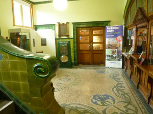
Pontefract Museum 03Although the library was converted into a museum after new library facilities were constructed in 1975, the original building still retains its Art Nouveau features. Pennington had been greatly influenced by the Art Nouveau movement and incorporated free flowing shapes and organic forms into his designs. These designs would not still exist today if it were not for the work of the Pontefract Museum curator Richard Van Riel. Van Riel used the early design plans of Pennington as his guide. Not only did he remove paint from the tiles and reposition doors, but Van Riel also replaced missing handles and reconstructed features that were in Pennington’s original plans. For example, each of the door handles was a unique design and could not simply be replicated from a pre-existing one. Van Riel had to locate a company that could specially cast the handles according to the original specifications. Other reconstructions were the curved oak reception desk and the iron railings outside the entrance to the building. These iron railings are particularly interesting because they were not actually realized when the library was opened in 1905. Van Riel included them in the restoration in order to replicate Pennington’s initial vision for the building, as these railings were part of one of the first design plans (pontefractus.co.uk).

Pontefract Museum 02Thanks to the restoration of the building, the Pontefract Museum is able to both contain and be a part of the history of the town. The building connects people to an important art movement that not only influenced architecture and modes of thinking in the United Kingdom but also the rest of the world. It reminds people of a time when education was not readily available and not everyone had access to books. It shows how community members can come together for the betterment of the whole, even forgoing pay as Pennington did. Finally, it shows how care for education and the welfare of people is not just a concern for immediate neighbours, but it is a concern for all. Carnegie provided the funds for the library, even though he did not even reside in the same country. The Pontefract Museum would not be what it is today without the giving of individuals such as Carnegie and Pennington, the gathering together of community members, or the dedication to conservation by museum professionals. The building not only tells the story of its past, but it also reminds visitors that they have a responsibility to their communities. Such a reminder is certainly worth preserving.

 For further information:

Carnegie, A. (2006). The gospel of wealth essays and other writings. Penguin. com.

http://www.pontefractus.co.uk/history/carnegie_library.htm

http://www.wakefield.gov.uk/CultureAndLeisure/HistoricWakefield/Buildings/CarnegieLibraries/PontefractLibrary/default.htm

http://www.philanthropyroundtable.org/almanac/great_men_and_women/hall_of_fame/andrew_carnegie

Posted in Uncategorized | Comments Off

JUGENDFEBER – A play about the love for Art Nouveau

The Art Nouveau Center in Norway 21.10.2013 – 08.11.2013

Jugendfeber - Ottar André Anderson

Jugendfeber – Ottar André Anderson

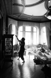
The play is a meeting between the audience and the different rooms and objects that occupy the Art Nouveau Center in Ålesund, Norway. The actress Ingrid Bakke takes the audience on a journey through the old pharmacy. Along the way they will encounter different characters who suffer from Art Nouveau-fever. The only thing that links these characters together is their love for the Art Nouveau objects. The play is about the beauty and esthetics of Art Nouveau, but also about what makes some people love it so much and what makes something beautiful.

Schools from around the county of Møre and Romsdal are the main audience, but the museum will also give the general public an opportunity to see this play in action and to experience Art Nouveau in a new light.

The Play is part of the Cultural Rucksack, a joint initiative of the Ministry of Culture and the Ministry of Education and Research in Norway. It’s collaboration between the Art Nouveau Center, Happy Monks production and The Cultural Rucksack in Møre and Romsdal.

Some of the objects included in the play, will also be digitized in the framework of Partage Plus.

Posted in Uncategorized | Comments Off

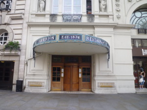
The Criterion Restaurant: Design, History, and Popularity

Written by Karoline Schwenker

P1060277There are many iconic buildings throughout London; but, aside from their aesthetic appeal, how much do people really know about the history of these structures? For example, people see the Criterion Restaurant and Theatre as the location where food is served and plays and musicals are performed (criterionrestaurant.com).  Yes, these features are true, but why is it such a famous location? Who built it? Who designed its artistic features? To answer these questions, one must first travel to Australia in the mid 1800s. At this time there was a gold rush occurring in Australia, and many people from England joined it.  One of these Englishmen was Felix William Spiers. After arriving in Australia, Spiers met a fellow Englishman named Christopher Pond. The two became fast friends and decided to open a restaurant for the increasing number of gold miners. The pair was a great success. Soon they were expanding into new buildings and sponsoring people to come to Australia for lectures and sports. Through sponsorship they brought many “firsts” to Australia, such as the first air balloon flight. Probably the most well known “first” was their bringing the first all-English cricket team to Australia, which also was the first commercial sponsorship of cricket (Spiers.net).

Although Spiers and Pond were very successful in Australia, they decided to return to England and expand their business into London. As they had noticed that there were no restaurants that catered to gold miners, the two men recognized that there were no restaurants near the railway stations for passengers. As a result, Spiers and Pond went about securing rights to build restaurants near these stations. By coincidence, the White Bear Inn outside of the Piccadilly Circus station was recently demolished, making it available for Spiers and Pond to build their restaurant (Spiers.net). The men chose Thomas Verity, a fellow of the Royal Institute of British Architects, to design the new building. Spiers and Pond wanted the building to contain a restaurant, dining rooms, ballroom, and concert hall. Construction began, but soon the men decided that, rather than a concert hall, a theatre should be built (victorianweb.org). The Criterion Restaurant and Theatre were opened 21 March, 1874, and were an instant success. Naturally, this was partially due to the popularity of the showing of H.J. Byron’s An American Lady and Topseyturveydom by W.S. Gilbert. The notoriety of the Criterion increased after Charles Wyndham became manager in 1875. Under Wyndham’s direction the theatre became one of the leading comedy venues in London (criterion-theatre.co.uk).

P1060312The Criterion Restauant and Theatre have undergone several renovations over the years. First, in 1883 the building was fitted with electricity and alterations were made to secure the safety of those dining and attending the theatre. The second, and most noticeable changes, were completed in 1903. It was decided that the Criterion required some modernisation. The task of structural design fell to the contractor William Webster. Additional features such as the wall decorations were completed by Simpson and Sons, specialist tiling contractors (wbsimpsonsons.co.uk). Once renovations were completed, the Criterion Restaurant and Theatre reflected the modern Art Nouveau style of architecture and design.

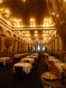
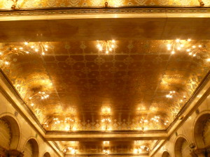
With Art Nouveau one must look at the building as “a total work of art” (Greenhalgh 2000). Each design or feature of the interior is supposed to relate to the other features. One can look at a particular design, but it is only by looking at everything together that one receives a complete picture. Another characteristic of Art Nouveau is the incorporation of nature (Escritt 2000). This can be seen in the both the exterior and interior design of the Criterion Restaurant. On either side of the “Criterion Restaurant” sign are swirling designs that mimic the movement of vines. The ceiling of the interior is decorated in floral patterns, as are the tops of the columns flanking the sides of the room. One design quality that is evident in the restaurant is the influence of styles from outside of Europe(Greenhalgh 2000). It was very common for designers to incorporate designs from Japan, China, Central Africa, and Islamic nations. In the Criterion one can feel a sense of Egyptian influence through the geometric shapes that decorate the fireplace and trim along the top of the walls. However, the ceiling reflects more of the designs from the Islamic nations, which becomes evident when directly comparing the ceiling to Islamic floral motifs.

P1060316There are two more points worth mentioning regarding the Art Nouveau style reflected in the Criterion Restaurant. First, Art Nouveau is meant to be deceptively simplistic (Greenhalgh 2000). When stepping into the restaurant, one notices the beautiful patterns, but it may not be blatantly clear that the designs are actually a complex combination of styles and ideas. The final point to address is some of the ideas associated with Art Nouveau. Art Nouveau was meant to incorporate both “modernity and tradition, anxiety and confidence, decadence and progress” (Escritt 2000). These designs grew out of a time of pleasure-seeking. The movement relied upon people consuming luxury goods (Greenhalgh 200). Out of all the Art Nouveau buildings in England, the Criterion Restaurant might be the best example of this concept of indulgence and luxury. When one steps into the buildings, immediately the eyes are drawn toward the ceiling. As mentioned, the ceiling is displays a beautiful floral design, but another feature is that this design is created using gold. The ceiling is worth millions, making it the epitome of luxury. Again the style may appear simple, but in this case there certainly is more to the design than people realize.

With such extravagant surroundings it is not surprising that the Criterion Restaurant has been the host to many noteworthy individuals. One of the most famous stories, albeit fictional, is that the Criterion is the place where Sherlock Holmes first met Dr. Watson. However, it was a real life dining location of Sir Arthur Conan Doyle who imagined the scene occurring at the Criterion Long Bar. Other nonfictional diners were the first suffragettes, Winston Churchill, David Lloyd George, Edgar Wallace, Sir Hugh Walpole, G.K Chesterton, Bertrand Russell, and H.G. Wells acting as chairman for the Royal College of Science’s first annual dinner. While the Criterion has been the restaurant of choice in the past, it is still a popular venue today. Not only do locals and visitors reserve tables for an unforgettable dining experience, but it is still a favourite location for politicians, members of the Royal family, and stars of the stage and screen. Most recently it has been used for scenes in the movies “Batman: The Dark Knight” and “A Good Year” (criterionrestaurant.com). The Criterion has a rich history, but it also has a rich present. It is well worth visiting the Criterion Restaurant to view its beautiful Art Nouveau architecture and designs, recall the historic moments that took place inside its walls, and to think about the modern celebrities who have dined at its tables.

For Further information:

Greenhalgh, P. (2000). Essential art nouveau. V&A publications.

Escritt, S. (2000). Art nouveau. Phaidon Press.

http://www.criterionrestaurant.com/history

http://www.victorianweb.org/art/architecture/verity/1.html

http://www.criterion-theatre.co.uk/History/Timeline-per-Decade

http://www.arthurlloyd.co.uk/CriterionTheatre.htm

http://www.spiers.net/pond.htm

http://wbsimpsonsons.co.uk/

http://www.arthistoryunstuffed.com/defining-art-nouveau/

Posted in Uncategorized | Comments Off

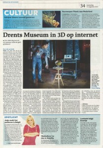
Drents Museum in 3D

scanning_dmIn today´s issue of the Dutch newspaper “Dagblad van het noorden” readers can find an article about 3D scanning at the Drents Museum. 130 art works from the collection “Art 1885-1935″ will be 3D scanned by the team of Steinbichler Optotechnik this week, among them some fine examples of both the constructive and the decorative movements within the Nieuwe Kunst as well as Art Nouveau furniture, glass, silverware, stoneware, ceramics and textiles. Not only the process of 3D scanning is described in the article, also the mission of the Partage Plus project is presented in detail. Followers of the Partage Plus Blog are recommended to check back regularly to catch a first glimpse of some marvelous Art Nouveau objects from the Drents Museum!

dm_scanning

Drents Museum in 3D


Posted in Uncategorized | Comments Off

‘Melk is goed voor elk’ (Milk is good for everyone) A healthy dose of Dutch common sense in the Nieuwe Kunst (New Art)

Each Dutch child is familiar with the phrase ‘Melk is goed voor elk’ (‘Milk is good for everyone’). This phrase is in keeping with the intrinsic Dutch rural common sense of ‘acting normal is weird enough’. In art, this is expressed in austerity and rationality. A characteristic of the typically Dutch form of Art Nouveau, Nieuwe Kunst, is its lack of embellishments. It is firmly grounded in functionality.  This continues in contemporary ‘Dutch Design’.

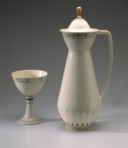
Chris van der Hoef, Milk coupe

Chris van der Hoef, Milk coupe & jug

A good example of Nieuwe Kunst is this milk service by Chris van der Hoef (1875-1933), part of the collection of objects being three-dimensionally scanned for Partage Plus. The decorations on the earthenware are sober, using stylized, mostly completely abstract forms. It is a textbook example of what is called the ‘constructive movement’ within the Nieuwe Kunst. For designers such as Van der Hoef, choice of material and functional purpose of the product were their first considerations. Decorations are of subsidiary importance. This simplicity and rectilinearity are contrastive to the ‘decorative movement’ which is more internationally oriented and which often takes the decoration as starting point for the construction.

Designer versus executor

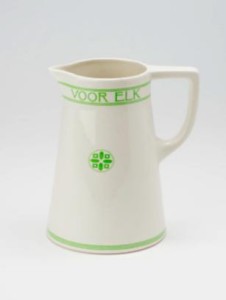
Chris van der Hoef/ N.V. De Sphinx, Milk jug

Chris van der Hoef/ N.V. De Sphinx, Milk jug

The 3D scanning for Partage Plus is special in that the objects are made digitally spacial, which allows us to approach the designer’s original idea. At the same time the functional purpose of the object is emphasized. If it were possible to check the bottom of the object, several marks would be found: the designer’s mark, the executor’s mark and often even the seller’s mark. This cooperation is characteristic of the ideals of Art Nouveau, which gave new appreciation to workmanship.

Van der Hoef designed several milk services for various factories, of which these are two examples: the form of the first design is sharper than the form of the second, which looks more luxurious. Services designed by Van der Hoef were often aimed for a wider audience. His ‘cube’ service is well-known; in this design, the decoration has been reduced to a few basic cubes. Van der Hoef’s work was internationally successful and was considered ‘typically Dutch’.

Collection Drents Museum

In addition to this milk service, some 130 objects from the collection Art 1885-1935 will be 3D scanned this week, among them some fine examples of both the constructive and the decorative movements within the Nieuwe Kunst. In addition to earthenware, furniture, clocks, textiles and sculptures will be scanned. Together, these images will give a representative image of the Nieuwe Kunst around 1900.

Written by Annemiek Rens/ Acting curator Art 1885-1935, Drents Museum Assen (NL)

Images

1) Chris van der Hoef (1875-1933) (design)/Tegel en Fayence Fabriek Amphora, Oestgeest (execution) Milk coupe and jug with inscription ‘Melk is goed voor elk’ (Milk is good for everyone), approx. 1908-1910 Earthenware, 15,5 cm and 37 cm high/Collection Drents Museum

2) Chris van der Hoef (1875-1933) (design)/N.V. De Sphinx (execution)/De Woning (seller) Milk jug with inscription ‘Melk is goed voor elk’ (Milk is good for everyone), approx. 1903-1904 Earthenware, 20,5 cm high/ Collection Drents Museum Assen

Posted in Uncategorized | Comments Off

The Turkey Cafe, Leicester

Written by Karoline Schwenker, Collections Trust, UK

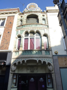
Turkey Cafe 01In an age where old buildings are torn down to make way for new construction, it is nice to hear of a location that has remained relatively intact for over a century. In the early 19th century, the land around what is now the Turkey Cafe at 24 Granby Street was once the home of inns, blacksmiths, stables, pigsties, and homes. One can only imagine the mixture of odours and noise. While families did work and live in the area, morality and honesty were not always present. This is evident by the Falcon Inn losing its license in 1873 for being a house for prostitutes. However, situations improved as ownership of the land changed and new stores were established. In 1877, James Wesley, a grocer and confectioner, bought the land next to what used to be the Falcon Inn. He owned the land until 1899, when he sold 22 Granby Street to Arthur Wakerley. Wakerley already had his first tenant in line, John Winn. John Winn was a restaurateur and already owned the Oriental Cafe in Leicester. The offices of Wakerley’s architectural practice were above Winn’s Oriental Cafe, making it easy to negotiate a deal regarding the construction and occupancy of a new cafe on Granby Street. Wakerley approached the Royal Doulton Company for help constructing his design for the new “Turkey Cafe” (Farquhar 1987).

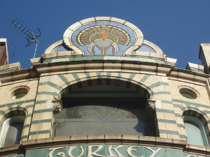
Turkey Cafe 02The style of the Turkey Cafe reflected what was popular at that time, which was the new trend of art nouveau. The building created a sense of stability by visually implying a pyramid structure. This was done by having seven arches on the ground floor and then decreasing the number of arches on each level. The pyramid is completed with a single turkey located at the top of the building. The building was coloured blue, green, and buff, which allowed any onlooker to fully appreciate the shapes and curves of the building’s designs (Farquhar 1987). The facade was constructed using tiles, hollow blocks, and a type of terra cotta called carraraware.  The Doultons actually developed carraware in 1888, which is a matt-glazed stone-ware.  The carraware tiles of this frontage were handmade by William Neatby, a ceramic artist who worked for the Doultons (Taylor 1997). In addition these features, art nouveau can be found in the decorations etched into the front window, as well as the red and green art nouveau designs of the rear tea room windows (Farquhar 1987).

The Turkey Cafe was opened in September 1901 and was renumbered 24 Granby Street. As a tea room, the cafe was popular with women. Not only was it a respectable venue for gathering, but it provided a convenient meeting place to discuss the progress of women’s rights (Taylor 1997). However, the cafe was not designed with only women in mind. Located in the back of the cafe was the Smoke Room. This room with its dark interior provided a place for men to gather and converse as well.  The popularity of the cafe rose so high that in 1911 Winn expanded into the building next door, which used to be Wheeler Kendall’s “Umbrella Manufacturer and Can Stick Merchant.” This change allowed Winn to expand the restaurant and storage space, and add a billiard room (Farquhar 1987).

Further renovations were made in 1927 when Winn decided to modernise the entrance, making the front appear more art deco than art nouveau. Wakerley allowed for the changes, as long as Winn restored the shop to its original appearance once the lease was done. Unfortunately, when Winn’s family sold the Turkey Cafe to the Brucciani Bakers Ltd. in 1963, no restoration actually occurred.  Under the Brucciani family, the Turkey cafe became a coffee and ice-cream shop. The reputation of the cafe as a location for woman to gather continued, and in 1966 the cafe had a “Ladies Only” room. Of course, once the Sex Discrimination Act was passed in 1974, they could no longer prohibit men from entering. In 1968, the cafe was once again renovated. The result was a mixture of old and new. The original interior tiled walls were panelled over, a tiled mural of a turkey was added, and smaller windows were inserted (Farquhar 1987).

The Turkey Cafe underwent yet another renovation process when Rayner Opticians Ltd. purchased the property in 1982. The interior was altered greatly to accommodate the new business that it would house, and curved windows were added to the above stories. However, the etched glass windows on the ground floor and the front arch were kept and restored to their original condition (Farquhar 1987). Rayners tracked down the Hathernware Ceramics Ltd. of Loughborough who was the only firm experienced in using the terra cotta material needed for restoration (Midlands Heritage 2011). The opticians were also fortunate enough to have the original architectural drawings and a 1910 photograph, which architects Sawday and Moffat had in their archives. Rayners then commissioned Deardon Briggs Designs Ltd. to follow these plans for the restoration process and creation of reproductions. In the end, the restoration of the exterior cost over £30,000, with the Leicester City Council contributing £5,000 (Farquhar 1987).

For two decades the building served as an optician’s office, but in 2004 the building was returned to its original purpose. The current owners of the Turkey Cafe do run it as a cafe (Midlands Heritage 2011). The building has also been listed as a grade two building for its art nouveau style architecture, making it clear that the building is of architectural and historic special interest (Taylor 1997). To the people of Leicester, the building certainly is worth preserving and does have an interesting history. The building has served as a cafe, restaurant, meeting place, ice-cream parlour, and unexpectedly an office for opticians. While numerous buildings were destroyed during and after the World Wars, including all of Winn’s other cafes, the Turkey Cafe has remained (Taylor 1997). Now, the building has come full circle, standing restored in its original appearance and serving as a cafe. It certainly would be a perfect location for someone to sit back, enjoy a cup of coffee, and be transported back to an earlier time.

Links to further information:

Taylor, M. 1997 The Quality Of Leicester, Leicester: Leicester City Council. http://www.leicester.gov.uk/your-council-services/lc/storyofleicester/cityheritage/builtheritage/theturkeycafe/

Midlands Heritage http://www.midlandsheritage.co.uk/miscellaneous-heritage/4601-turkey-cafe-leicester.html

Farquhar, Jean http://cdm16445.contentdm.oclc.org/cdm/compoundobject/collection/p16445coll2/id/3911/rec/1

My Leicester History Website http://cdm16445.contentdm.oclc.org/cdm/compoundobject/collection/p16445coll2/id/4098/rec/14

My Leicester History Websitehttp://cdm16445.contentdm.oclc.org/cdm/search/searchterm/Turkey%20Caf%C3%A9/mode/exact

Posted in Uncategorized | Comments Off